
Case study · Workforce development · Stamford, Connecticut
Southwest CT Tech Hub: a new initiative, given a page of its own.
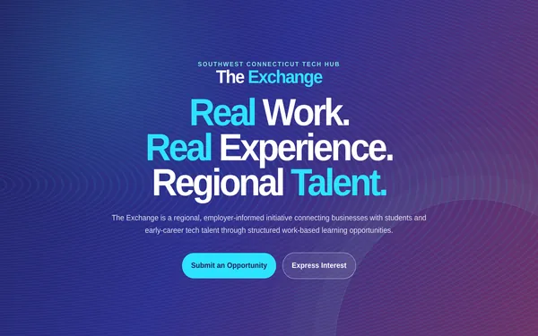
The Southwest Connecticut Tech Hub already had a website. What it did not have was a home for The Exchange — a new regional initiative connecting employers with students and early-career tech talent. Two design directions, a prototype the committee could actually click, and a WordPress build inside the site they already run: live in about six weeks.
The starting point
The Southwest Connecticut Tech Hub is a regional partnership based in Stamford that connects Fairfield County employers with people entering technology careers. Its website was already complete and in use. The Exchange was the new part: an employer-informed program that had to be explained clearly enough for a business to submit a real project, and for a career changer to raise their hand. So this was not a redesign. It was a new page that had to look like it had always belonged there — and it had to clear a committee before anyone outside the organization would see it.
What was done
- Two directions, built instead of mocked up. I designed two directions for the page and built both as working static pages rather than presenting flat images. The committee could open them on a phone, scroll them and press the buttons, which is a very different conversation from reviewing a picture of a website.
- The approved direction, finished in HTML. Once one direction won, it was built out in full — final structure, the six-step process, responsive behaviour — and taken back through review as a link, so each round of feedback landed on the real thing.
- The client’s brand, applied. The Tech Hub supplied its own mini style guide. My job was to apply it — the indigo and cyan palette, the typography, the logo — so the new page reads as part of the organization rather than a visitor to it.
- Two intake forms, built from scratch. The whole page funnels into two actions: an employer submitting an opportunity, and a candidate expressing interest. I built both from zero, with their own fields and their own destinations, so the two audiences never land in the same pile.
- Built for the phone, and animated. Most of the people this page has to reach will open it on a phone, so the layout is built for that first: the six-step process stacks into one readable column, type and spacing scale with the screen, and the two buttons stay large enough to hit with a thumb. The page also moves — sections animate in as they come into view and the cards and buttons respond to hover and touch — and the motion respects the reader’s reduced-motion setting, so nobody gets animation they did not ask for.
- Rebuilt in WordPress and published. With approval in hand, the page was rebuilt in WordPress inside cttechhub.org and published at /the_exchange/ — inside the site the team already knows how to use.
- About six weeks, most of it review. The build was not the slow part; the approval cycle was. Committee work means shipping things that can actually be reviewed, and versioning them so one round of feedback does not undo the last.
Since launch
The page went live recently, so there are no numbers to report yet — and I would rather say that than invent some. The Tech Hub team runs it from WordPress; Argus does not maintain it. That was part of the point: the page lives inside a site the organization already controls, so nothing about it depends on me still being reachable.
What this says about how I work
Not every project is a website from scratch. A good share of the work is adding something new to a site that already exists, in a brand somebody else wrote, for people who have to approve it before it ships. That takes prototypes instead of mockups, versions instead of arguments, and a build the client’s own team can maintain afterwards. It is the same discipline behind a five-page site for a business in Stamford — see website design for what a project includes and what it costs.
Something new to add to a site you already have?
Free estimate, no commitment. A one-page site starts at $1,500, a five-page site at $3,200 — flat, in writing, before anything starts.